Finalists have been announced for this year’s Dulux Colour Awards, highlighting innovative uses of colour in design, with new Sydney venue Busby’s among the finalists in the Commercial Interior – Public and Hospitality category.
From a record 527 entries, 83 projects have been shortlisted across the eight categories, providing an insight into the leading trends in colour and design.
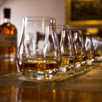
The judges have remarked that this year’s shortlist demonstrates a deeply considered, intelligent approach to design across the board. Within the hospitality and retail spheres, judges were particularly impressed with the use of colour psychology to entice customers.
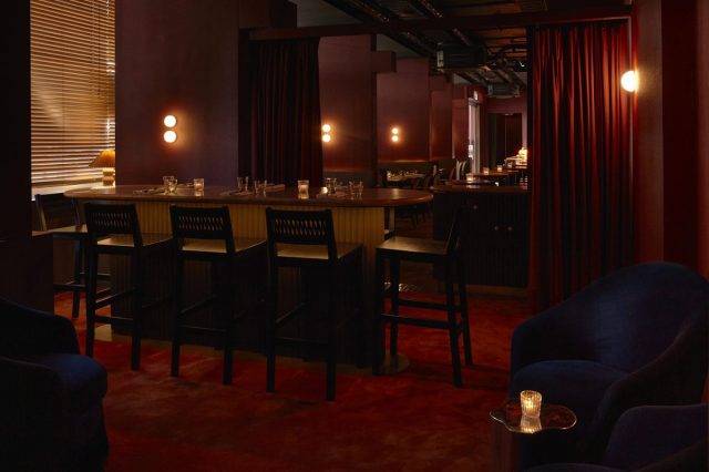
Moody colour palettes dominate the shortlisted hospitality venues, with warm russet browns, burgundies, and cherry reds enhanced by low lighting. Retro elements are also evident through the use of wood panelling and rattan. Public Design Studio, the team behind the design of Busby’s, adds an element of contrast through the addition of armchairs upholstered in royal blue velvet, creating visual interest within the space.


Andrea Lucena-Orr, Dulux Colour and Communications Manager, commented on the design trends indicated in this year’s awards.
“This year, biophilia – the affinity of humans with the natural world – is a strong theme, with earthy colours playing a dominant role in interiors. Olive greens, warm greys, muted taupes and dusky blues are coming into their own across several categories,” she said.
Warm neutral tones have also made an appearance in this year’s entries, with warm whites and soft beiges appearing across textured surfaces. This tendency towards softer tones is reflected in Dulux’s Colour of the Year, Sweet Embrace, a pale rose-lilac. Increasingly, these colours are being layered, with several shades of cream or beige appearing within the same space.
“Gone are the days of a single white or beige being specified for an interior. Now, nuanced shades of a colour are being utilised to create highlights, details and contrasts within the one project. It’s a sophisticated design strategy and it’s not confined to interiors.” Andrea said.
However, bright colours still feature in the awards, with saturated candy tones and high contrasts appearing in several shortlisted designs.
“It is an uplifting trend that shows a newfound optimism and confidence to try unexpected combinations for surprising and fun spatial impact. Architects and designers, as well as their clients, seem to have shaken off the gloom of the lockdown years and are expressing a profound sense of freedom through paint colours that epitomise playfulness and joy,” Andrea said.
Colour is not just limited to interior design, either, with Andrea noting that this year’s finalists are extending innovative uses of colour to building exteriors.
“We’re also seeing bold graphics and murals in external applications, surprising contrast colours of pinks and blues, and a lot of textural effects. It’s thrilling to see that every surface, every element, inside and out, is being considered in the overall colour scheme when a designer or architect is devising the palette,” she said.
The Dulux Colour Awards’ Student category is another interesting element of the awards, with two Sydney Design School students shortlisted for hospitality design concepts. Caroline Apport’s Alchemy and Gabriela Vegas’s Campo de’ Fiori give an insight into the concepts that emerging designers are bringing to the table.
The 38th Dulux Colour Awards winners will be announced during Vivid Sydney on 29 May, at an exclusive event held at the Sydney Opera House.